
16MAR 2013
 © These basic principles are three:
— Flexibility (dinamic and mobility required for the
transformation of the object as a consequence, not
having an initial moment, no clear terms of reference,
no conditions on the design).
— Plurality (the general set up of interconnected oneness).
© These basic principles are three:
— Flexibility (dinamic and mobility required for the
transformation of the object as a consequence, not
having an initial moment, no clear terms of reference,
no conditions on the design).
— Plurality (the general set up of interconnected oneness).
 ©
— Three-all decisions (principle, implying a need for
a response by each individual element and the whole
structure of all three major issue in our opinion):
1. The image of the country.
©
— Three-all decisions (principle, implying a need for
a response by each individual element and the whole
structure of all three major issue in our opinion):
1. The image of the country.
 ©
2. The functionality of the structure.
©
2. The functionality of the structure.
 ©
3.
©
3.
 © The motto of the Expo
Realizing that Expo 2010 will take place in China, one of
the most dynamic and rapidly developing countries in the
world with a huge population, and that is, apparently, the
main audience Expo, we decided that it would be of no small
importance to our pavilion more comprehensible Chinese
visitors.
It turned out that the basis for understanding of the
Universe, inherent to our ancestors and ancient philosophy
to Chinese tradition, are very similar.
© The motto of the Expo
Realizing that Expo 2010 will take place in China, one of
the most dynamic and rapidly developing countries in the
world with a huge population, and that is, apparently, the
main audience Expo, we decided that it would be of no small
importance to our pavilion more comprehensible Chinese
visitors.
It turned out that the basis for understanding of the
Universe, inherent to our ancestors and ancient philosophy
to Chinese tradition, are very similar.
 © Chinese triad - Land,
Man, Sky - «Tai Chi» - coincided with the ideas of ancient
Rus about Mother Earth and Father-Sky, which creates an
emptiness between themselves.
«The unit produces a deuce, deuce birth to three, so there
is all that exists» (Dao De Jing).
© Chinese triad - Land,
Man, Sky - «Tai Chi» - coincided with the ideas of ancient
Rus about Mother Earth and Father-Sky, which creates an
emptiness between themselves.
«The unit produces a deuce, deuce birth to three, so there
is all that exists» (Dao De Jing).
 ©
World ocean or “the abyss of heaven”, from which is growing
world tree, and 9 of heaven, the seventh of which is Viry
(Paradise) as a wonderful legendary white- golden city of
happiness were the backbone of the Slavic world-view.
«On the seventh heaven,» we say so far.
©
World ocean or “the abyss of heaven”, from which is growing
world tree, and 9 of heaven, the seventh of which is Viry
(Paradise) as a wonderful legendary white- golden city of
happiness were the backbone of the Slavic world-view.
«On the seventh heaven,» we say so far.
 ©
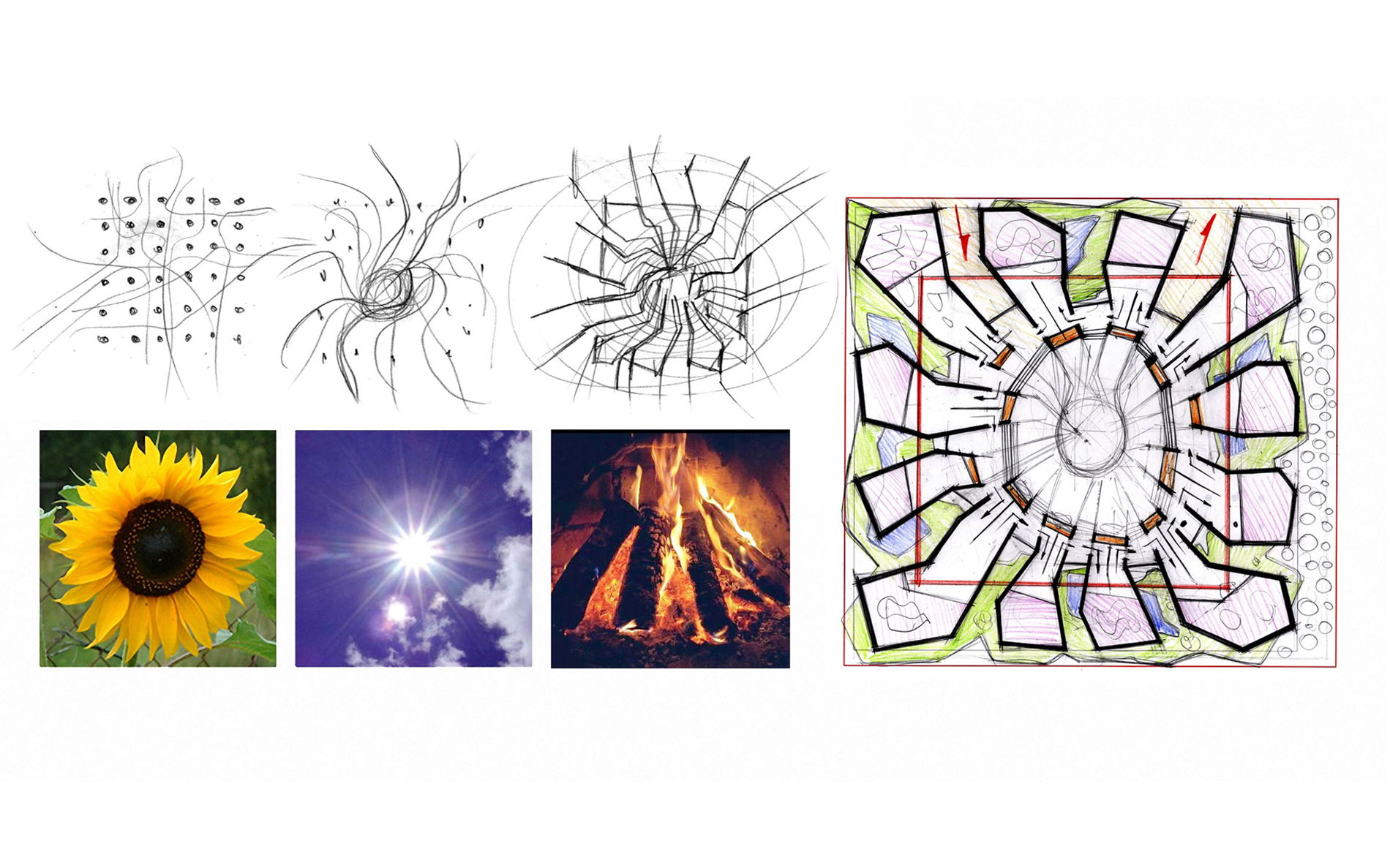
The first variant, was taking part in the competition, was
developed by us in accordance with the above principles,
which in turn made it possible, keeping imagery and some
basic decisions, rework the concept of the pavilion twice.
©
The first variant, was taking part in the competition, was
developed by us in accordance with the above principles,
which in turn made it possible, keeping imagery and some
basic decisions, rework the concept of the pavilion twice.
 ©
The final version of the pavilion, modified by time and
technical parameters (budget and timeline in the end
have been cut by more than two-fold) was approved by the
Organizing Committee of the Russian Federation to the
building at the Expo - 2010 in Shanghai.
The three-fold composition is at the basis of the Russian
pavilion.
©
The final version of the pavilion, modified by time and
technical parameters (budget and timeline in the end
have been cut by more than two-fold) was approved by the
Organizing Committee of the Russian Federation to the
building at the Expo - 2010 in Shanghai.
The three-fold composition is at the basis of the Russian
pavilion.
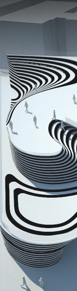
 © The second imagery component is the dynamic
nature of urban structures, a reference to the idea of
changeability — the chief notion of the Chinese philosophy.
The Book of Changes, the main spiritual text of the Chinese,
postulates constant change as the core of existence.
© The second imagery component is the dynamic
nature of urban structures, a reference to the idea of
changeability — the chief notion of the Chinese philosophy.
The Book of Changes, the main spiritual text of the Chinese,
postulates constant change as the core of existence.
 ©
We keep alive solely while observing changes.
©
We keep alive solely while observing changes.
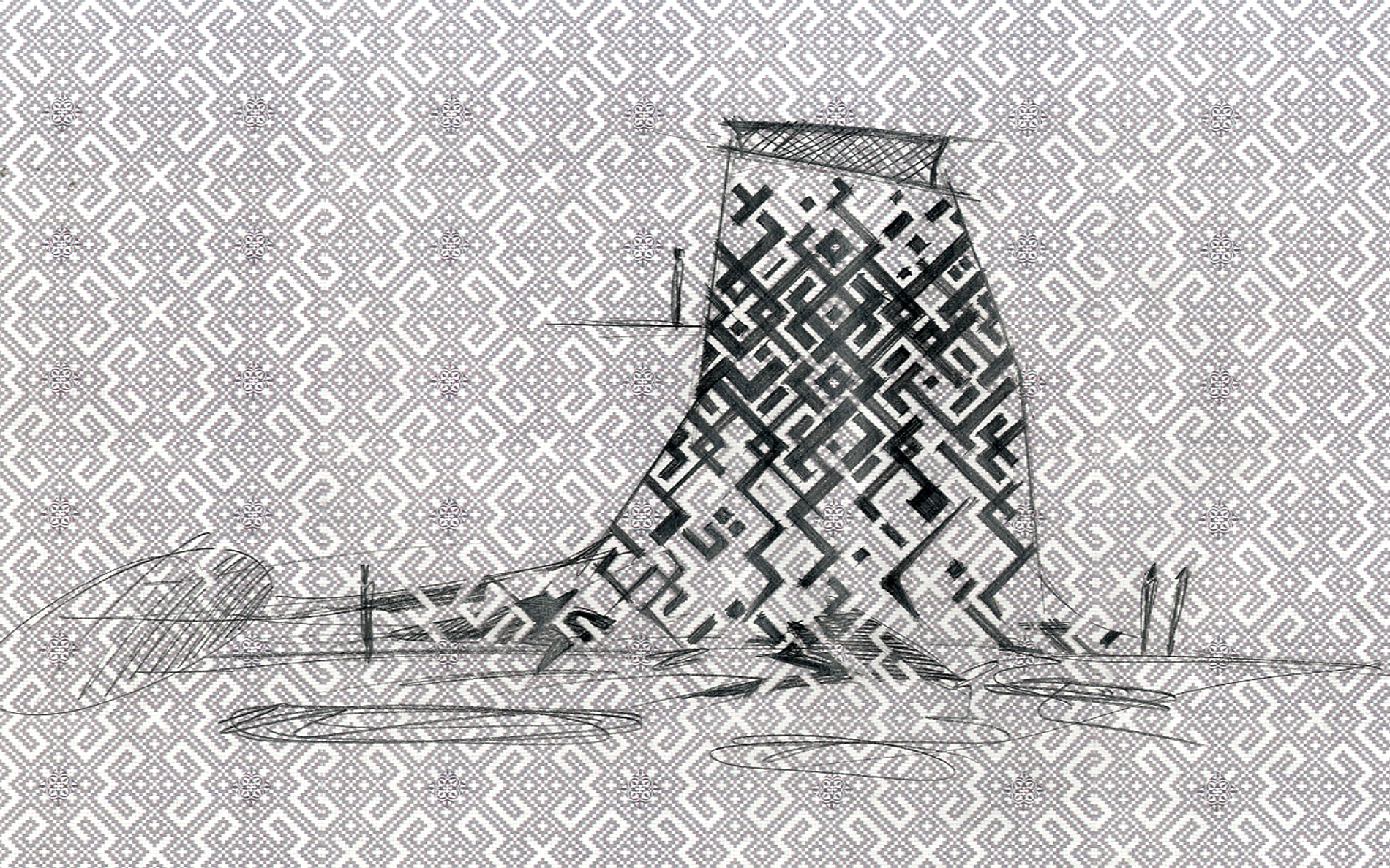
 © Correlation
of these two concepts (the three-fold structure and the
idea of changeability) provides basis for the image of the
Russian pavilion. Its structure consists of three major
elements: 1) a block of 12 L-shaped white-and-gold towers,
2) a cube measuring 50x50 m that seems suspended in
mid-air (in fact, it rests upon the horizontal parts of the
12 L-shaped towers), 3) an internal installation A City of
Flowers, ref lecting the children's idea of the future of
modern cities.
© Correlation
of these two concepts (the three-fold structure and the
idea of changeability) provides basis for the image of the
Russian pavilion. Its structure consists of three major
elements: 1) a block of 12 L-shaped white-and-gold towers,
2) a cube measuring 50x50 m that seems suspended in
mid-air (in fact, it rests upon the horizontal parts of the
12 L-shaped towers), 3) an internal installation A City of
Flowers, ref lecting the children's idea of the future of
modern cities.
 ©
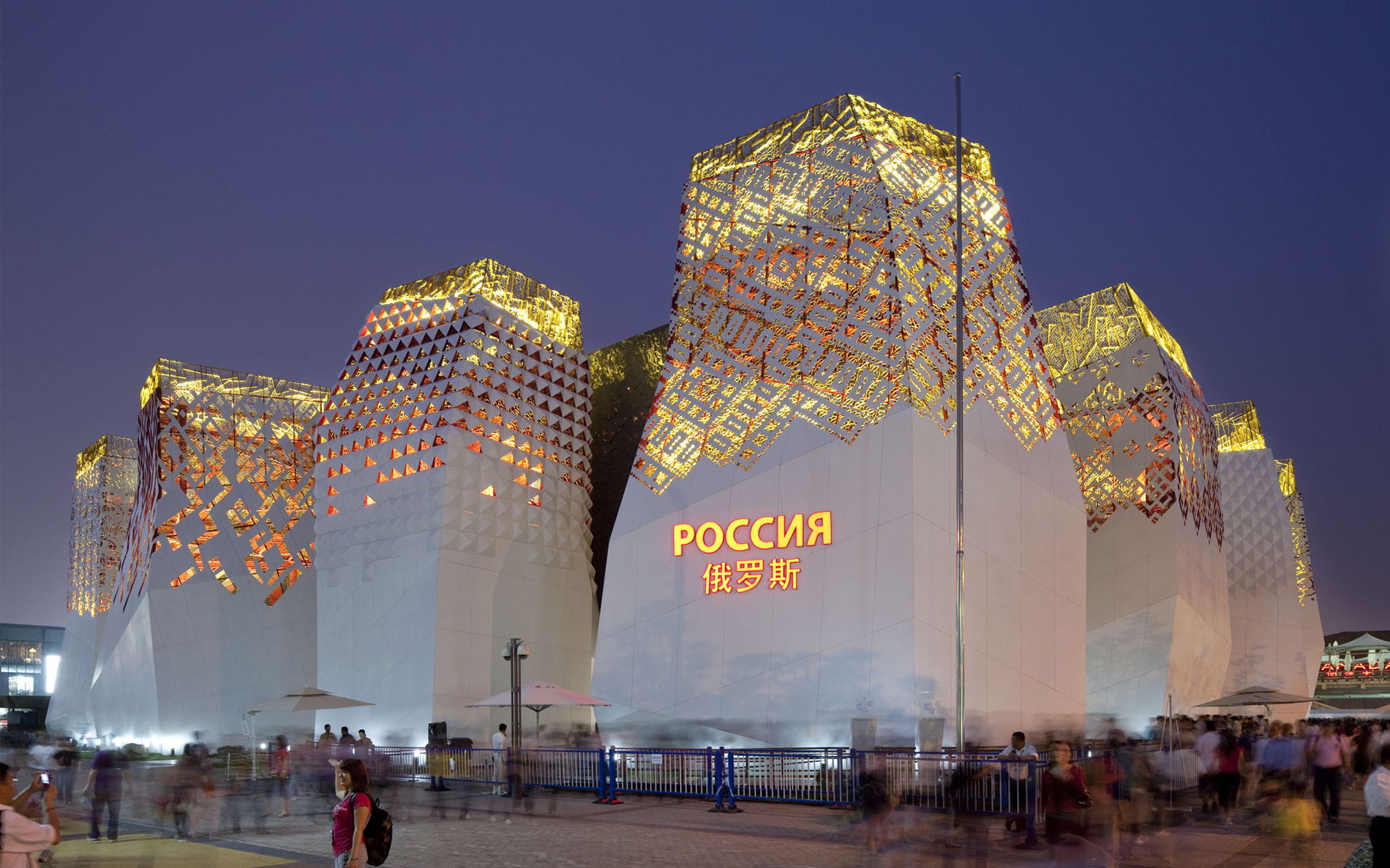
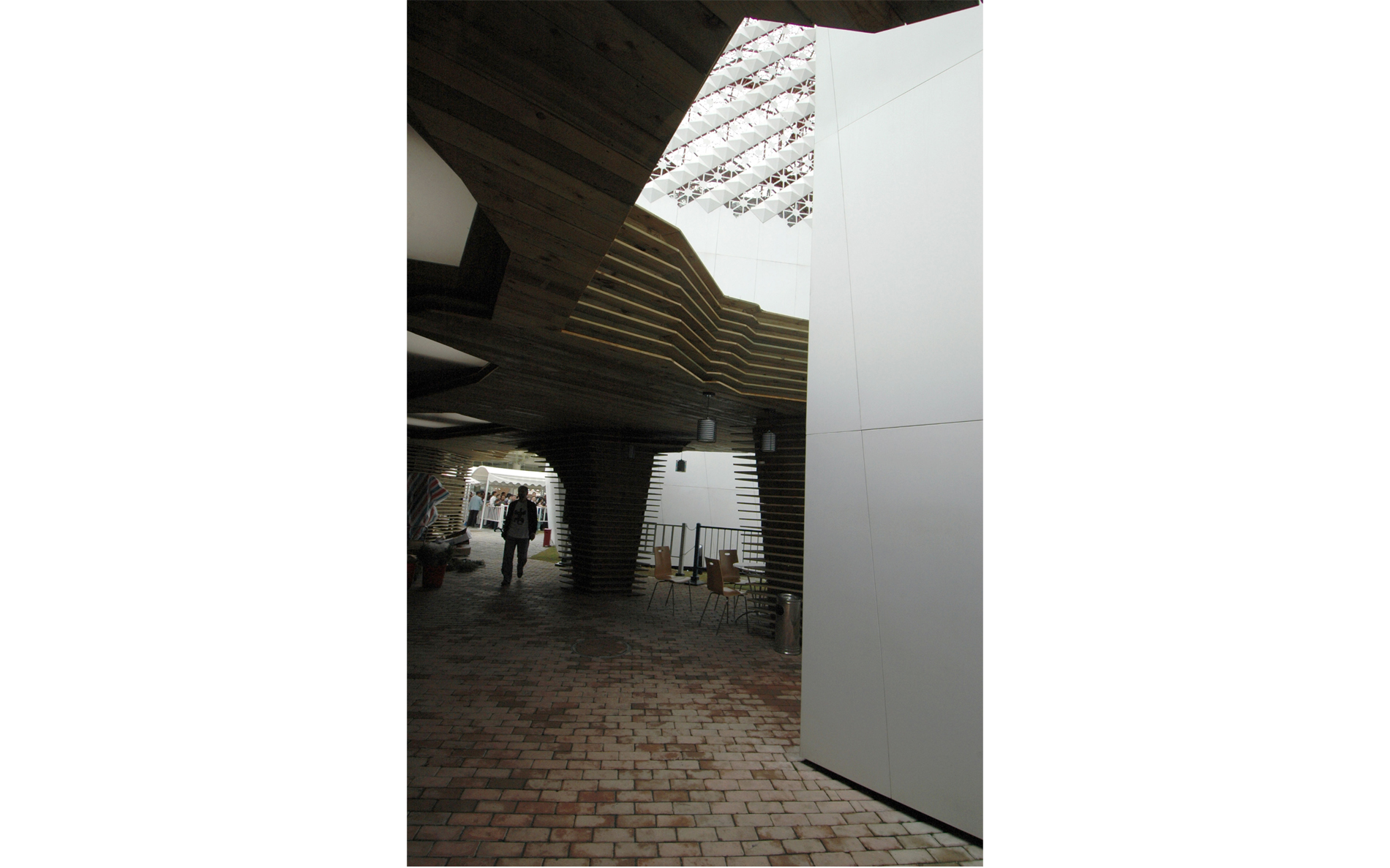
Placed in a natural landscape with meadows and lakes
around it, the block of 12 white-and-gold towers is prone
with a multitude of concepts pertaining to the theme of
the exhibition and the image of Russia. The ultra-modern
shaped towers rush upwards, symbolizing rapidly developing
cities with sky-scrapers of non-lineal architecture.
©
Placed in a natural landscape with meadows and lakes
around it, the block of 12 white-and-gold towers is prone
with a multitude of concepts pertaining to the theme of
the exhibition and the image of Russia. The ultra-modern
shaped towers rush upwards, symbolizing rapidly developing
cities with sky-scrapers of non-lineal architecture.
 © At
the the same time they allow a natural park, an integral
part of city structure, to be placed into the space between
them. The circumference of the park zone thus becomes a
semblance of a city square which, together with the towers,
composes an urban triad.
© At
the the same time they allow a natural park, an integral
part of city structure, to be placed into the space between
them. The circumference of the park zone thus becomes a
semblance of a city square which, together with the towers,
composes an urban triad.
 © The balance of proportional
relations within it guarantees successful development of
polycentric structures of modern cities.
© The balance of proportional
relations within it guarantees successful development of
polycentric structures of modern cities.
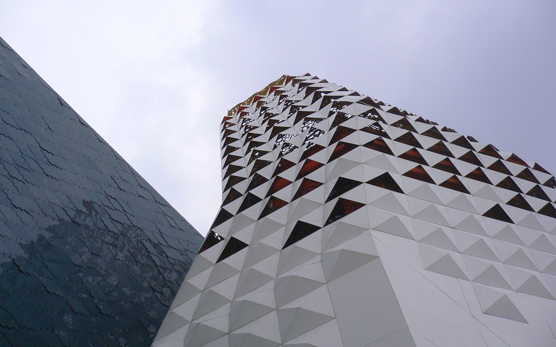
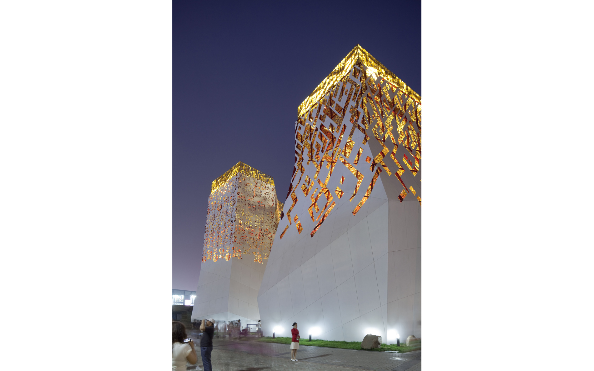
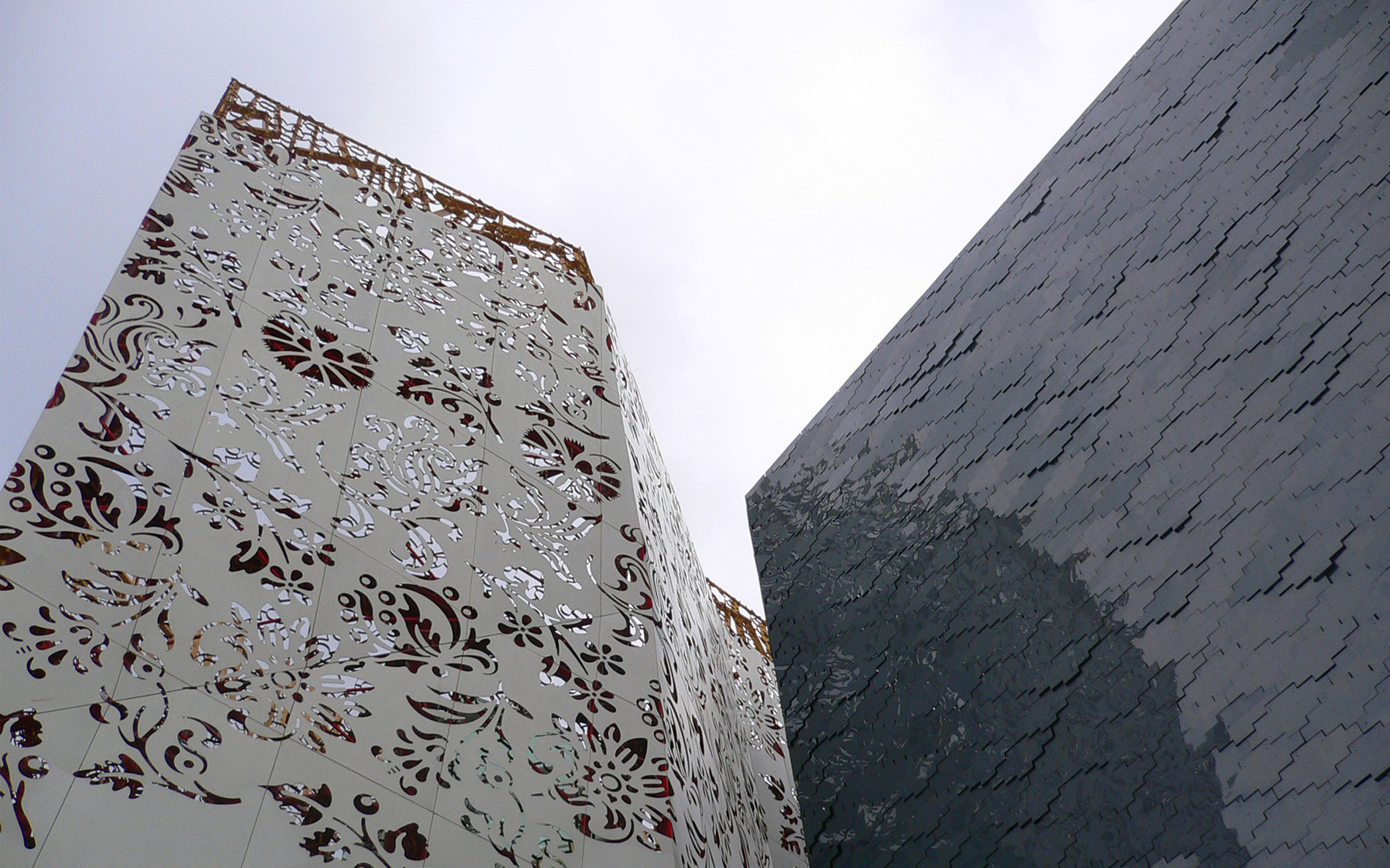
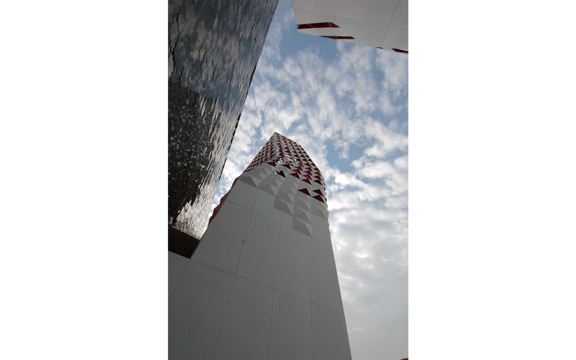
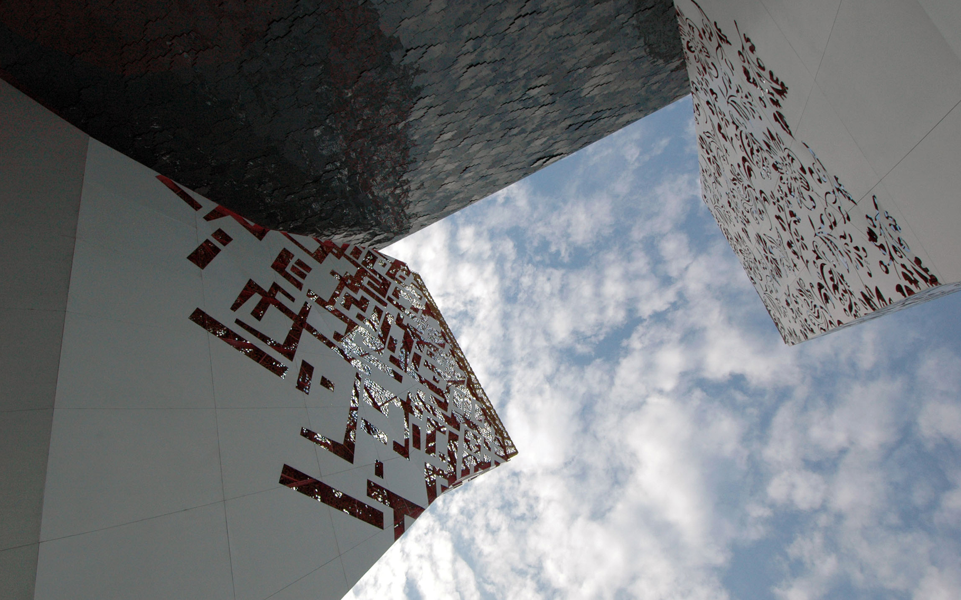
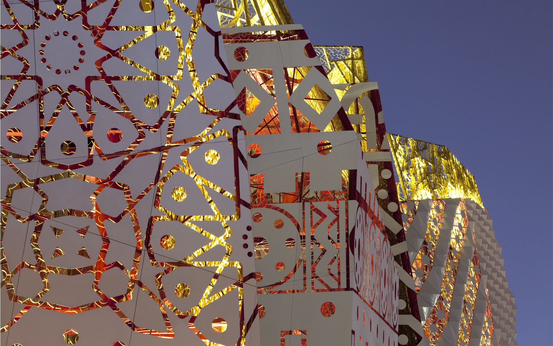
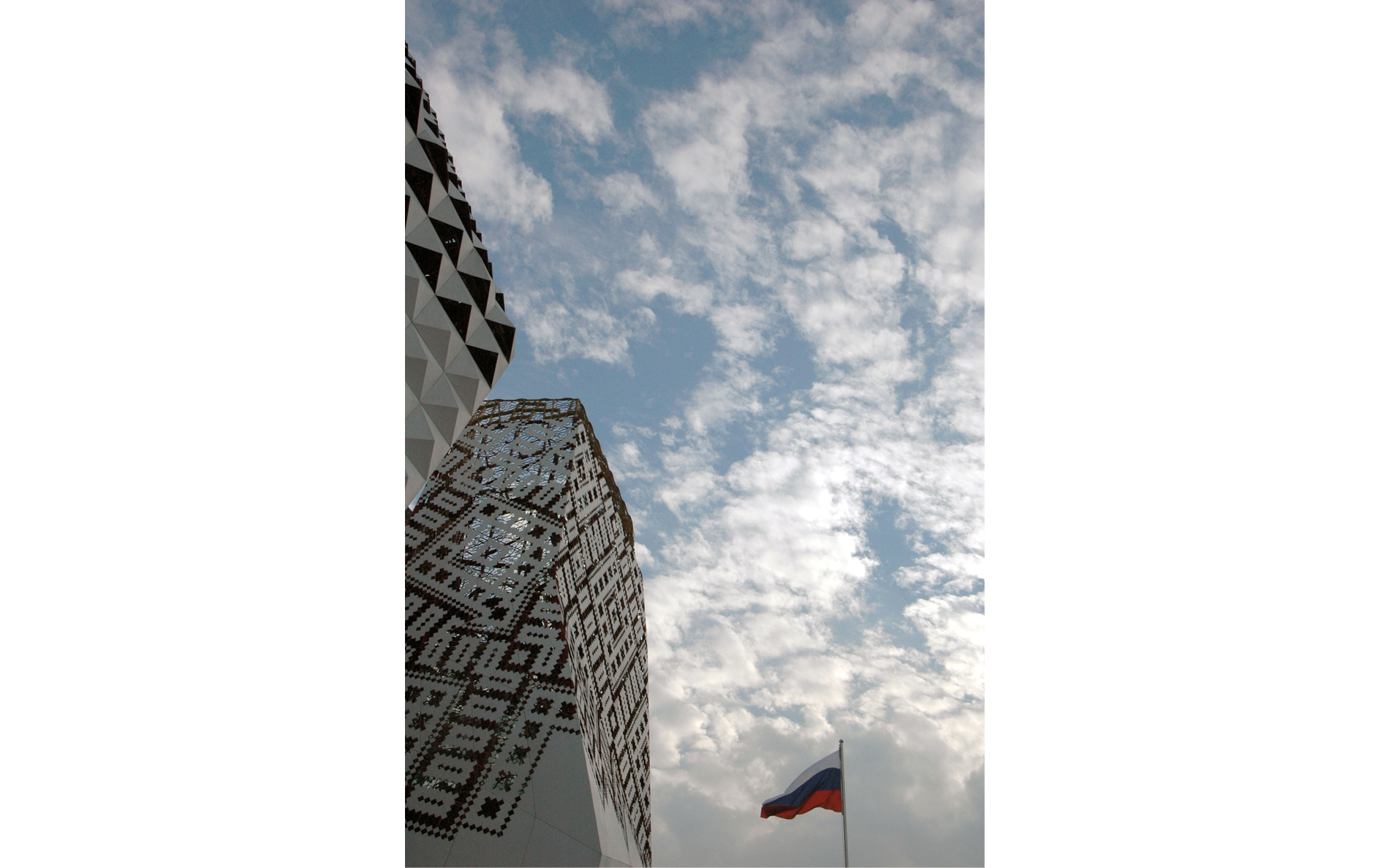
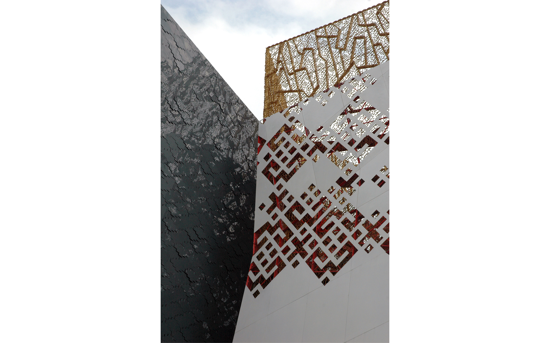
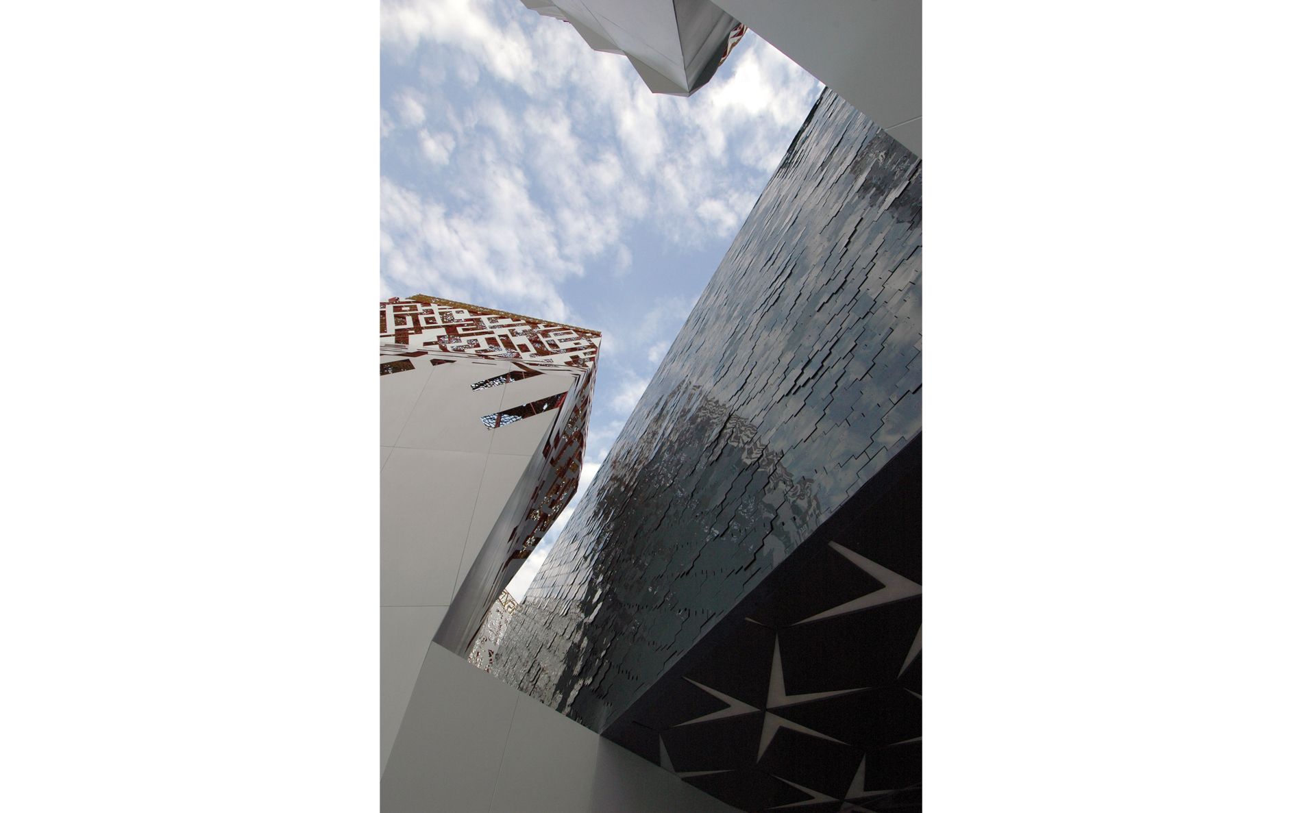
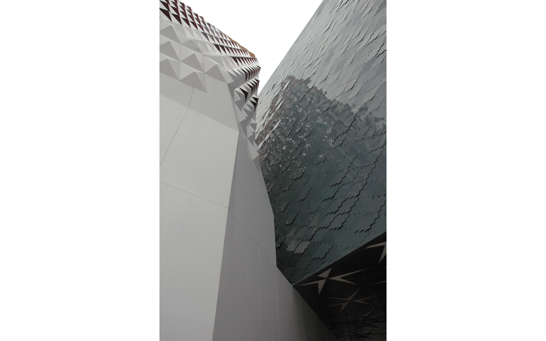
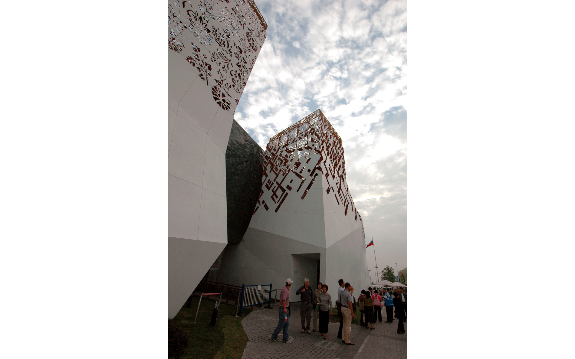
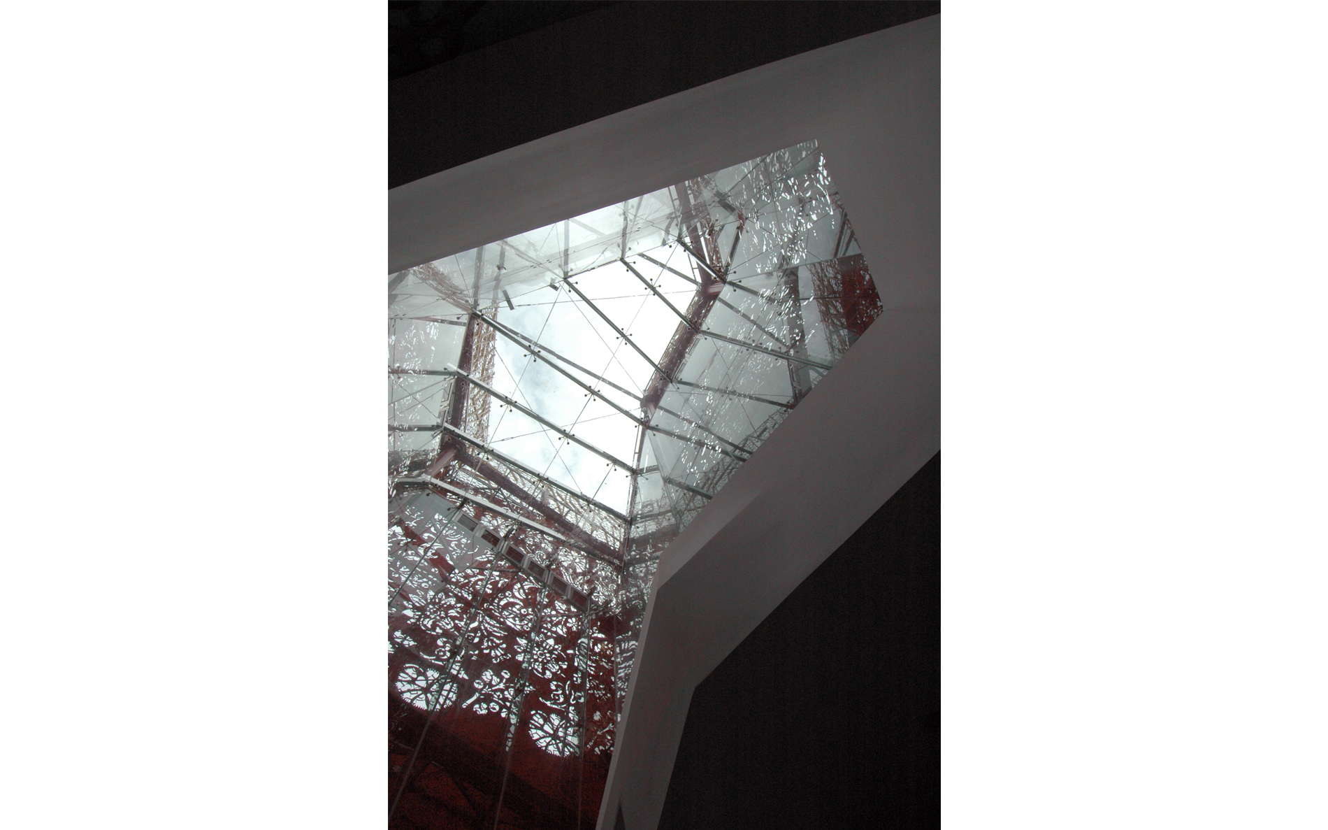
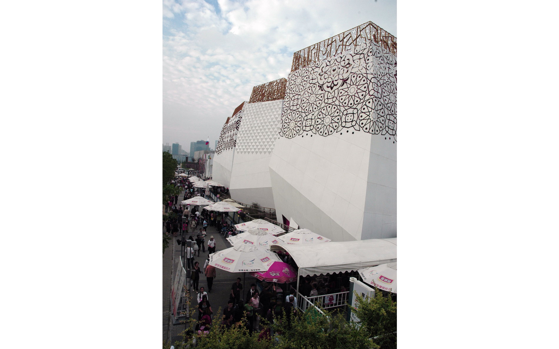
 © The white-and-gold
towers are a reference to traditional Russian architecture,
while the red background colour enlivens the decorative
perforation in their upper parts. The perforation patterns
are based on ethnic decorative motifs of Russia's diverse
nationalities; they stand for incompleteness of the process
as a promise of further development and growth.
© The white-and-gold
towers are a reference to traditional Russian architecture,
while the red background colour enlivens the decorative
perforation in their upper parts. The perforation patterns
are based on ethnic decorative motifs of Russia's diverse
nationalities; they stand for incompleteness of the process
as a promise of further development and growth.
 ©
The plan of the pavilion is similar to that of ancient Slavic
settlements (e.g.
©
The plan of the pavilion is similar to that of ancient Slavic
settlements (e.g.
 © Arkaim settlement in the Chelyabinsk
region dating back to around 3000 BC) and structures like
Stonehenge. Its circular structure is a solar symbol as well
and a reference to the roots of the World Tree (the Slaves'
large oak) supporting the heavens of life on its branches.
© Arkaim settlement in the Chelyabinsk
region dating back to around 3000 BC) and structures like
Stonehenge. Its circular structure is a solar symbol as well
and a reference to the roots of the World Tree (the Slaves'
large oak) supporting the heavens of life on its branches.
 ©
The 'roots' of the towers, oriented towards the centre
of the composition, provide support for the Cube of
Civilization, a reference to the Man component of the
T'ai Chi triad.
©
The 'roots' of the towers, oriented towards the centre
of the composition, provide support for the Cube of
Civilization, a reference to the Man component of the
T'ai Chi triad.
 © This symbol has been given a geometrical,
artificial - 'human' - shape of a cube. On the outside it is
divided into 12 000 elements, corresponding to the number
of inhabitants an administrative unit should have in order
to be rated as town, not a village, in accordance with the
Russian law.
© This symbol has been given a geometrical,
artificial - 'human' - shape of a cube. On the outside it is
divided into 12 000 elements, corresponding to the number
of inhabitants an administrative unit should have in order
to be rated as town, not a village, in accordance with the
Russian law.
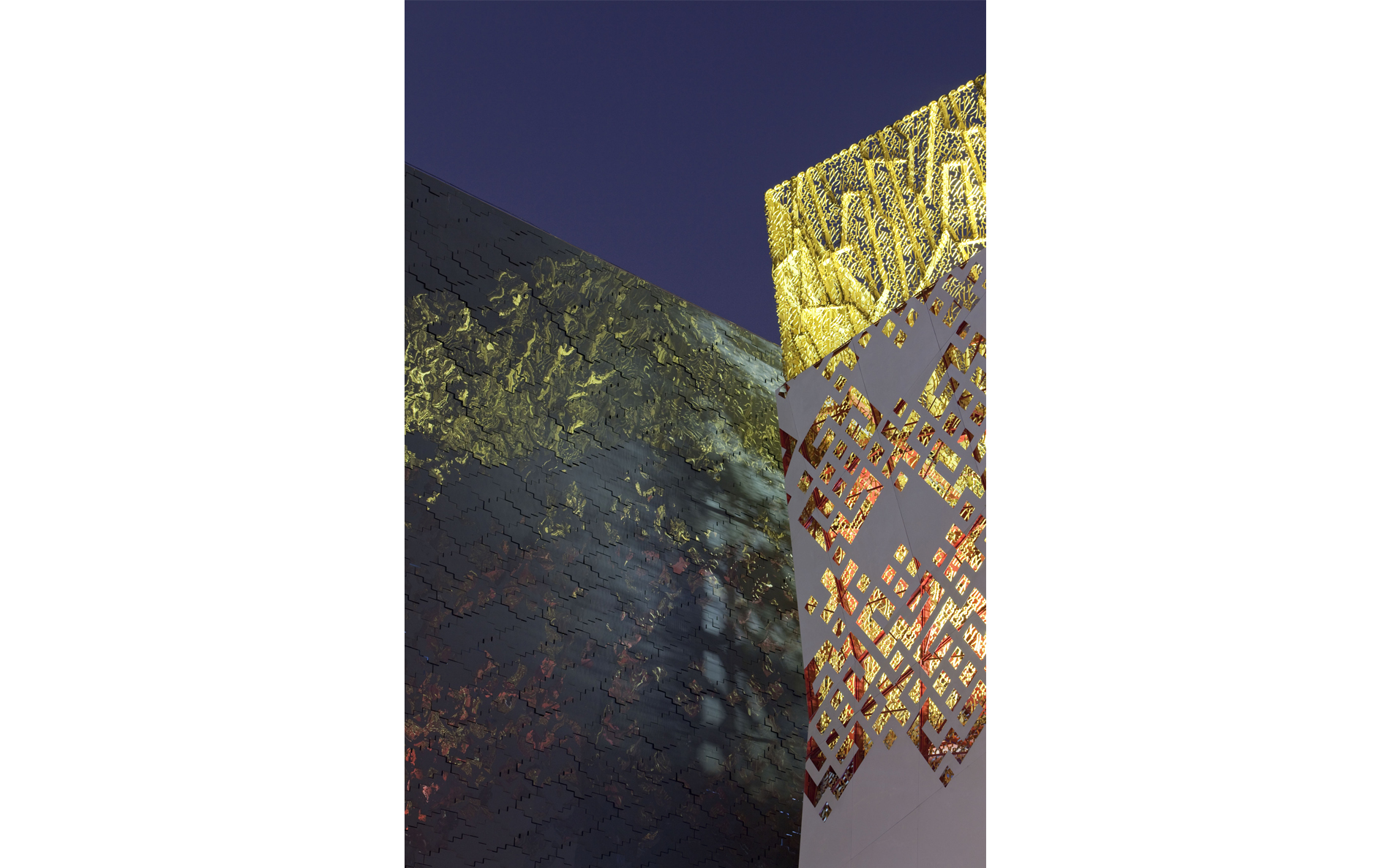
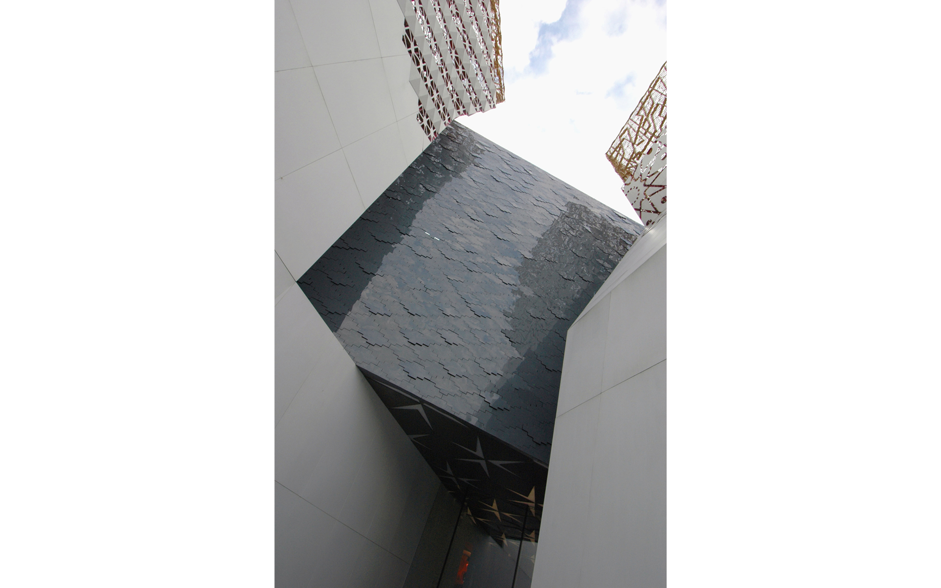
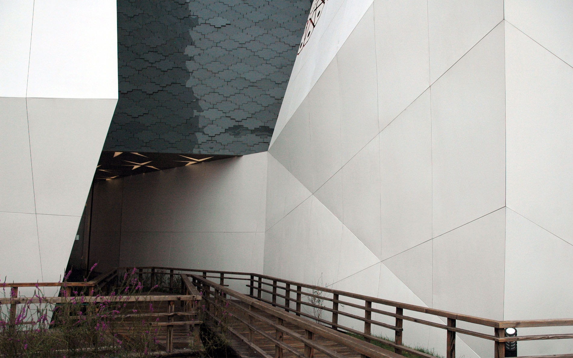
 ©
The elements constituting the exterior surface of the cube
have a potential of getting into motion, which produces an
effect of huge 'live' surfaces ref lecting the sky, the towers,
the trees and the people. The effect would be that of a giant
living being (the Man), while at night the structure would
make a still more stunning impression thanks to the use of
a special lighting system.
©
The elements constituting the exterior surface of the cube
have a potential of getting into motion, which produces an
effect of huge 'live' surfaces ref lecting the sky, the towers,
the trees and the people. The effect would be that of a giant
living being (the Man), while at night the structure would
make a still more stunning impression thanks to the use of
a special lighting system.
 © It would turn into a changing light
and colour dynamic screen..
© It would turn into a changing light
and colour dynamic screen..
 ©
©
 ©
©
 ©
©
 ©
©
 ©
©
 ©
©
 ©
©
 ©
©
 ©
©
 ©
©
 ©
©
 ©
©
 ©
©
 ©
©
 ©
©
 ©
©
 ©
©
 ©
©
 ©
©
 ©
©
 ©
©
 ©
©
 ©
©
 ©
©
Russian pavilion at EXPO Shanghai / TOTEMENT/PAPER
Posted in Architecture - Architecture by TOTEMENT/PAPER
After we get the invitation to participate in the competition for the design of the Russian pavilion at Expo 2010 and before to proceed directly to the development of space-planning and imaginative concepts, we decided to work out some general principles, consideration of which we would consider it extremely important and important in our future work.© © © © © © © © © © © © © © © © © © © © © © © 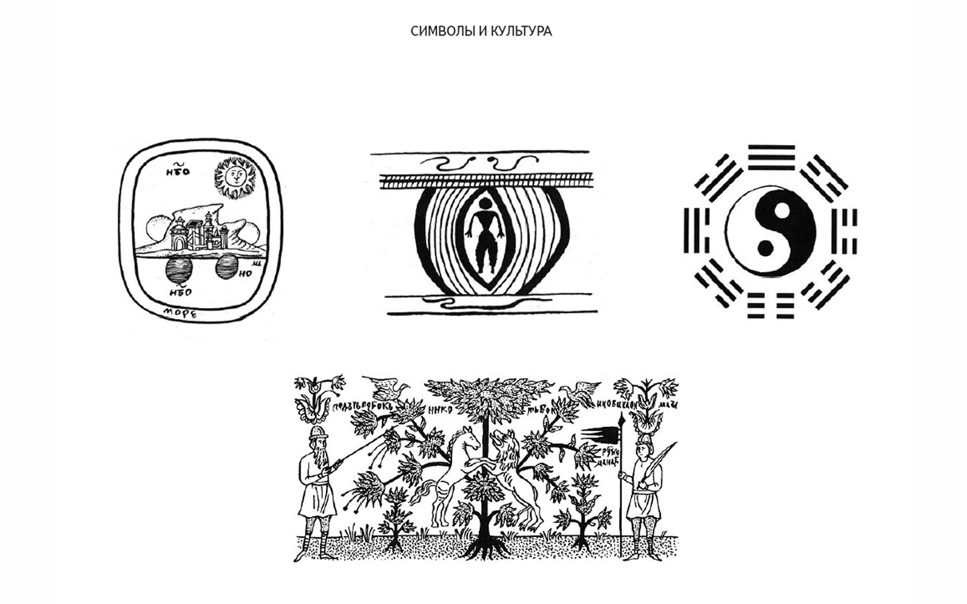 ©
©
 ©
©
 ©
©
 ©
©
 ©
©
 ©
©
 ©
©
 ©
©
 ©
©
 ©
©
 ©
©
 ©
©
 ©
©
 ©
©
 ©
©
 ©
©
 ©
©
 ©
©
 ©
©
 ©
©
 ©
©
 ©
©
 ©
©
Comments
No comments
Sign in »